Whether it's a simple card tucked behind a sugar bowl or a leather-bound book covered with gold-leaf lettering, the way you present your food and drinks on your menu can have a big impact on your takings.
But despite the enormous impact that the design and layout of menus can have, a startling number of independent cafe and restaurant owners seem content to fire out a basic list of dishes, pop the company logo on the top, and hope for the best.
You don't have be a professional typographer or world-class graphic designer to create a menu that will help you push those high-value items and make your drinks and dishes sing, however. In fact, in this blog post, we'll be sharing five simple but effective tips to take your cafe or restaurant menu to the next level, boosting sales and drawing your customers' attention to the dishes you really want them to see.
Ready to make your menu sing? Let's get started!
#1 Forget the 'sweet spot' myth
For a long time in the restaurant industry, there has been a commonly held belief that customers' eyes are naturally drawn to the top-right quarter of the menu. Often referred to as the menu 'sweet spot', this area is thought to be where diners' eyes linger when choosing what to eat, prompting many restaurant owners to go out of their way to present dishes with high profit margins in this area.
The thing is, there's no reliable evidence to support this — the menu sweet spot is the industry equivalent of an old wives' tale.
That's not to say that we shouldn't be considering where diners' eyes tend to go when they peruse your menu, however.
According to a study conducted by San Francisco State University's Professor Sybil Yang, rather than simply looking to a menu's top-right corner as commonly believed, diners tend to scan menus from left to right 'like a book'. It seems that most will start at the top left, browse the starters, then make their way through the menu in order before heading back up to the mains.
While this doesn't mean that you shouldn't be attempting to draw people's attention to particular items on your menu, it does mean that you don't have to spend your time shoehorning your menu items into a prescribed format just for the sake of it.
#2 Keep your numbers inconspicuous
Short of launching some kind of avant-garde dining experience, you can’t completely banish your prices from your menu. That doesn't mean they should stand out, however.
You've probably noticed how many restaurants and cafes omit pound signs from their menus these days. This isn't just minimalist design nonsense — removing currency symbols can actually increase sales by keeping readers' focus on the dishes rather than making them fixate on the amount they'll have to spend to get at them.
There's more to it than that, though. In addition to keeping those pound signs small (or omitting them entirely), you should also consider the placement of your prices.
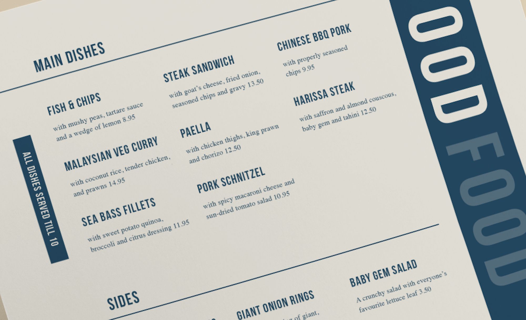
Check out the menu below. Consider how much less prominent those prices are when tucked in at the end of dish descriptions than if they were presented to the right of the dish's name as we so frequently see.

The change might seem marginal, but this placement has the effect of discouraging diners from simply running their eyes down a list of prices (and then avoiding the pricier options), and instead to focus on the descriptions rather than the asking prices.
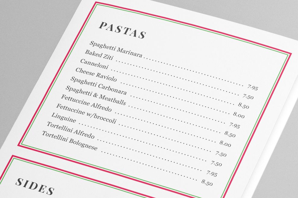
Finally, while we're on the subject of price placement, remember that you should never, ever use ‘leader dots’ on your menu.
These dots, stretching all the way from a description on the left to the price on the right, might have been popular once upon a time, and for that reason have a slight air of sophistication about them. The only effect they really have today, however, is to lead your customers' eyes away from your carefully crafted dish descriptions to the price they'll pay, shifting their attention from how best to please their palates to the impact the meal with have on their bank balance.

#3 Keep photos to a minimum
In the era of 'food porn' and Instagram, you might be tempted to include some snaps of your more tantalising dishes on your menu to really show them off.
Although there's nothing wrong with having the odd well-placed pic, adding too many photos to a menu can sometimes have the effect of devaluing your dishes.
The most likely explanation for this is that — in Europe and North America at least — we're most likely to see food items listed with photos on takeaway and fast food menus. Often, the images are generic and not representative of the actual food patrons receive, and this is something that we have become so attuned to that we almost expect the quality to be bad (or, in some cases, so bad it's good).
For that reason, it's usually a good idea to keep the snaps to a minimum on your cafe or restaurant menu. Avoid placing photos unless it's a true 'hero' product that you're featuring, or if the images are used as a way to break up what would otherwise be an imposing wall of text.
#4 Box 'em in
So how do you draw customers' attention to the items you really want to push? The answer is simple: box them in.
Boxes, shading and outlines can significantly increase the visibility of an item or group of items on your menu, grabbing the reader's attention and informing them that these items — this special little group right here — are especially worthy of their time.
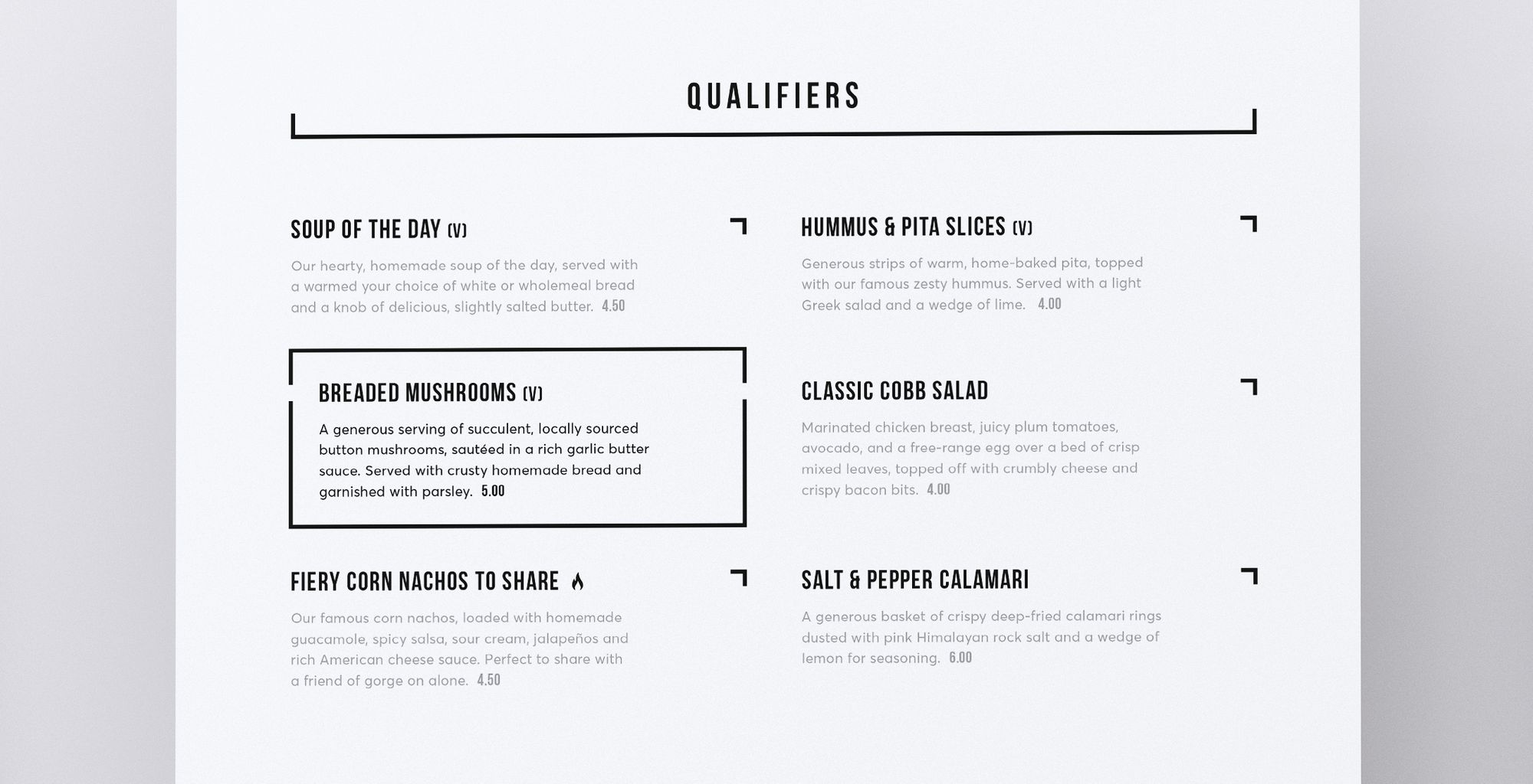
Breaded mushrooms are hardly the most exciting starter in the world, but consider how much more attention they'd get presented on a menu like the one below, than if they were listed in exactly the same way as all the other appetisers.

Items contained within these boxed areas feel special somehow. You can use this to your advantage by sectioning off groups of dishes (e.g. high-yield dishes; hamburgers; steaks etc), or individual dishes whose profile you wish to raise.
A word of warning, however: boxing should be used sparingly on your menu. Corner off too much of your menu and, as well as making it look so busy that customers will feel overwhelmed, any impact that the boxes would have had will disappear immediately. As a rule of thumb, aim to box no more than 10-15% of a page if you want to have any real impact.
#5 Consider decoy pricing
Our final tip today might seem a little bit 'out there', but you'd be surprised at just how effective a bit of decoy pricing can be.
The most commonly used type of decoy pricing is when retailers list multiple sizes of the same item with large jumps between small and medium but only a marginal difference between medium and large sizes. Noticing the negligible difference between the latter pair, most will shun the smaller sizes in order to get the most bang for their buck.
While this is in itself an effective pricing strategy, another approach to decoy pricing is to intentionally include one or more high-ticket items on your menu to increase perceived value of your other dishes.
Consider, for example, listing a £70 fillet cut at the top of your steak menu. Unless you're targeting a particularly niche market and specialise only in high-grade cuts of meat, it's unlikely that many customers will order it (and if they do, then great!).
But by following this costly cut with steaks costing just £30 or £40, customers will be more likely to perceive additional value in these items, and will be more likely to pay such prices than they might had the £70 fillet not be present.
Final thoughts
All too often, restaurant owners obsess over the look of their menu without considering how its design can play a key role in increasing takings.
It's important to create a menu whose visual design fits your brand and sets you apart from your competitors, of course. But it's just as important to consider how you can use your menu to influence customers' decisions and draw attention to particular dishes.
Your menu is where the majority of your customers start their journey — make sure they, and you, get off on the right foot.

